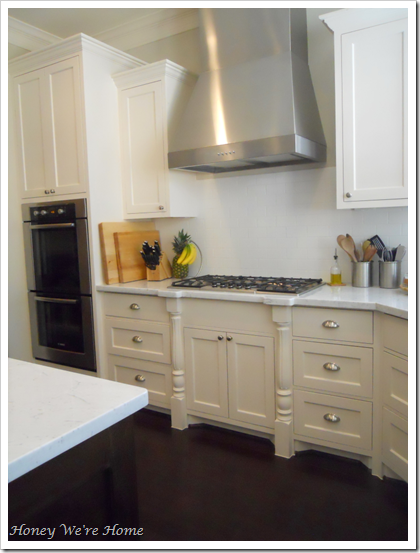
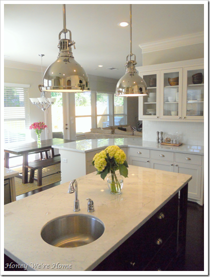
When we began designing our home, the only room I had a clear vision for was the kitchen. After pouring over decor magazines and design blogs for about a year, the images that kept appealing to me over and over had three things in common {white cabinets, white subway tile, and carrera marble counters}. After living in a townhouse with dark wood kitchen cabinets, black granite counters, and forest green walls, I knew I wanted a kitchen that was light and bright. We configured the floor plan so that we could have a kitchen window and ended up with two:) I’m so happy with how our light and bright kitchen turned out.
Come in, come in! I can’t wait to show you!
In an effort to keep the kitchen from being too blindingly white, we went with dark hardwood floors and island, and stainless steel appliances. The marble is gorgeous, but we do have to be careful with it. It scratches and stains easily. I realized early on that I had to “let it go” or I would go insane noticing every tiny flaw. To keep my sanity, I typically keep two large cutting boards on the island to prepare food and set things on.
The island was also designed with two shelves to hold my cookbooks, a second small sink for food prep (which is actually really handy), and three deep drawers on the far side. I love these drawers! The top one houses plastic bags, foil, plastic wrap and measuring cups/spoons. Second drawer holds Tupperware and the bottom one keeps paper towels.
The far cabinet doors are glass to give the space an open feel. That is the cabinet I keep our daily dishes like plates and bowls in, so it’s always organized.

This little area to the left of the fridge is command central. It’s where the coffee is made every morning and where I prepare my oatmeal. Our coffee mugs and glasses are kept in those cabinets. The microwave was originally intended to sit at the cabinet height, but that is too tall for this shorty, so we moved it to below. I will have to safeguard it since we have a little one that will be into everything soon.


On the opposite side, is the double oven and range. I think our range is similar to this
It’s nice to have a combination of drawers and doors for storage.

If you continue past the oven, you’re into the “mudroom” and the pantry is on the right. Out the door is my garage.

And we opted for one large farmhouse sink

We wanted the kitchen to open to the living room, but not completely, so that you still have a little separation. I like how there is some divide between the rooms. The pendant lights (one of my absolute faves) are from Lighting Inc. in Houston, Texas. They really add that bit of drama and are what most people comment on when they come over. They also look really cool at night.

If you have any questions about our kitchen, let me know and I’ll do my best to answer them for you. You can see my inspiration kitchens here.
**********


0 comments:
Post a Comment